Thursday, March 7, 2013


This was originally two almost identical pictures of Sadie. The slight difference was her eyes were open in one and closed in the other. I combined them to make it look like one face. 
This was the same picture, although I changed it to mirror itself. This allowed me to combine them and make it seem as if there wee two of them. 


I originally was going to have this picture of a bowl from two different angles, from the front and side. However, I tried taking two almost identical pictures and only using half of each one. I used a collage editor to put the two together, and lined them up to try and make it seem  like it was one picture. 

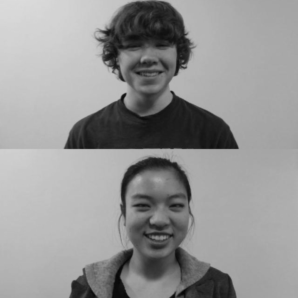
These are old pictures I had from when I did a series in the Richard Avedon style. I chose to put them together for this series, and the simplicity of the pictures makes the detail in their faces stand out. 

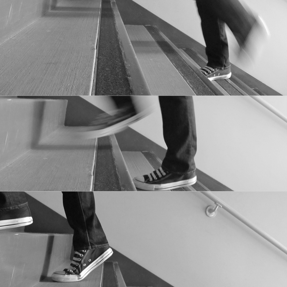
This was taken as somebody walked up the stairs. I like the motion in the first two pictures, and without it, it would seem like the person was just standing on the steps. 

I originally wanted this picture to be one of his entire face and one of half his face, but they didn't fit together. So instead, I flipped the picture so one is backwards. I like how you can't tell that one is the original and the other is the duplicate. 

For my next two pictures, I faded one picture into the other. The first picture was of the sky and trees, and the blended picture was of words from a newspaper. I like this because they're opposites, the cramped writing and the nature. 

I took used three pictures of Sebastian's hand and faded them on top of each other for this picture. First I faded the two together, and then saved it as one and faded the third on top. I like it because the hand almost looks as though it's in motion. 


I took a picture of this olive oil bottle from two different angles. I like it because the stripes go in opposite ways, yet their presence allows you to know the two pictures are of the same thing. 

Thursday, February 28, 2013

For this week, my series will be in black and white. I was inspired by my shoe series to work with the shades of grey that are such a huge part of taking good black and white pictures. I also wanted to try and work on combing pictures like I did before, as I really enjoyed finding ways to edit them together.

Thursday, February 21, 2013

Series

In all of the pictures, I made everything except for the shoes black and white. I thought that this made the shoes stand out more than they usually would. 

My favorite part of this picture is the shoe laces, as they show how the picture was taken while in the middle of a jump. I also like the shadow in the back, because it makes it seem like she's being suspended in the air rather than jumping. 

I chose this picture because it actually looks like she's about to step down. Also, it's just such an ordinary picture, and usually nobody would notice their shoes. 


I like how the bricks on the steps show repetition. This makes my eye automatically go straight to the shoe, as it's the break in the pattern. 


I like how the feet are uneven, and one is raised higher than the other. This contrasts the similarities between all of the other bricks. 

I like this because at first, your eyes are drawn to Drew. Then, out of the corner of your eye, you notice that there's something in the upper right corner that sticks out; the shoes. 

I chose this because the stones show all the shades of grey that make black and white so interesting. The picture is very uneven, as the square with the stones is not in the middle, but the shoes make up for it. It's like the stones are weighing one side of the picture, and the feet are holding down the other side, making them equal. 


I chose this because I really liked how the first foot is blurry, yet the second one is focused. This too is a  very simple, ordinary picture, which is why I think it's interesting. 

My favorite part of this picture is the shadow. In the bottom right corner, there is another shadow that draws your eye in. It's almost like the shadows are in their own world. 

I took this picture right as Frankie was jumping onto the tree. I like it because the picture is all grey, and very similar shades. Therefore, the shoes subtly jump out. 

Friday, February 8, 2013

Ideas for Assignment

1. A series of black and white pictures that would focus on showing the different shades that make black and white pictures different. Also, the contrast between the white and black.
2. A series of combination pictures, where either the pictures are combined into one picture, or are cloned to make a sequence. It would show relation and similarities between objects, or the process of an event such as somebody jumping.
3. A series of objects that are very simple with basic color backgrounds. It would be one object in the picture, or two objects that went together in some sense.

Thursday, February 7, 2013


I darkened this picture so that the sky was completely black, however in the process, the buildings became dark as well. This makes it look very shadowed and dark, even though in reality it was taken on a very bright and sunny day. 

I chose this because in a way, the tree is more the negative space, but at the same time, the sky could be. When I first look at the picture, my eye automatically focuses on the background, and gradually moves to looking at the branches. 

I took this picture while looking through the eye of a mask in the student lounge. I like it because it's different from the usual round cut out, and it's like you're looking at the building through a telescope. 

I took this picture while looking into the camera so that the buildings were dark. How it is right now, the buildings look like more of a silhouette and the sky pops out. This makes the buildings the negative space, although usually they would be the subject. It's the opposite of my other picture of buildings. 

This picture was taken through a circle I made with my hands. I chose to make it black and white because the tree matched he color of my hands around the side, and made the grey pop. I like the hands in the picture because they're not a perfect circle which I think almost gives it texture. 

I chose to edit this picture of Frankie differently than the way I usually would approach it. It's colorful and unrealistic, which is not usually my style, however I like how the color pops out from the white space. Also, how the black hair and the white background give the picture simplicity, allowing the patches of color to look even brighter. 


Friday, February 1, 2013

For this assignment, I was focusing on combining two pictures into one. The two flowers in this picture are taken of the same picture, from two different angles. I think this shows how any object is so different depending on what angle you observe it from. I like it because at first, i t seems like they're one picture, because the backgrounds are so similar. 

This was at first meant to show a journey of the life of a tree. In every picture, there are leaves, which though aren't the focus, have a strong relation to trees. 

I chose this picture because I thought they went together in the way that the sky was a similar color, and the tree branches in the pictures looked almost identical. Also, the top is focused on the same tree, just in more detail and focused on one leaf rather than on the entire tree. 

I chose this picture because I don't usually leave pictures with their original coloring, I usually put a filter of either sepia or black and white on. I chose to put them together, because the top picture was zoomed in on a specific object, and the bottom was of the same flower in its natural habitat. 


I chose to clone this picture, so that it would show the stages of Frankie's jumping. They are faded in order to show their impermanence, and how they're all just phases in the jump itself. 

I combined two portraits, one of Benji and one of Seb. When I first put the pictures on top of each other, I didn't like it, because the faces didn't exactly go together. However, I decided to fade Benji's face to show. It could be symbolic in the way that somebody can have a mask that is obscuring half of themselves. The confusion of which face belongs could symbolize a real confusion about who they are.  

Thursday, January 17, 2013

I like how Amanada fades out slowly until she's almost translucent. It looks like she's actually running through the picture. 

I like how the front sink is so simple and nothing interesing, but the back sink is the one with the words. This makes it so that it might not catch your eye immediately, but after time it will. 

I liked how this picture was cloned so that the subject was not only the subject, but a part of the background as well. 

Once again, I liked the contrast between the smooth wood, and the plants that are next to them. Also, the wood is different shades, which I thought added colored varieties. The wood on the edge of the wall that runs perpendicular to the wall panels add even more interesting patterns. 

This was meant to be a music composition written onto a wall, but I didn't end up adding any music notes. When I experimented with the notes, it was chaotic. 

When I see this picture I never see "California Street" I see street that Drew School is on. This is how I know it, which is why I chose to change California into Drew School. I think that it's interesting how the Drew School catches my eye because I would expect it to be just some boring street sign. 

I think that these arrows are faint enough that they don't take away from the wood. The marks in the wood are moving in one direction, and the arrows seem to be moving in the opposite direction. I like this contrast, and I thought of the arrows as fish swimming up river. 
I chose this because the red of the strawberries and the black of the blackberries are opposite. This was even more intense when the picture was brightened. 

I chose to brighten this picture because I thought it would take away from the middle of the flower. This is because I wanted it to be a large contrast so I could use the word distinguished. I used it because it is distinguished in the way that it's the most subtle part of the picture, so it pops out. 

I like how the trees are silhouetted in this picture, and I think that the effect makes it even more distinct. I experimented with rounded corners which I thought added to the picture, and made it seem more like a clip from a movie or an old fashioned picture.