Friday, December 7, 2012

Richard Avedon


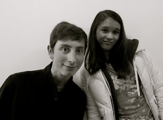
I thought that this picture was good for emulating the work of Richard Avedon in the way that he isn't trying to make a face, or force a smile. When I was taking the picture, my only instructions were to stand in front of the white wall, and I took the picture before he had the time to question what face he was supposed to make. This is why it's so natural. 

I chose this because his face is unusual, and Richard Avedon took most of his pictures of people who weren't the every day model type. He focused on telling the stories of different people, and wasn't exclusive to who he would take pictures of. Also, the rule of thirds allows the eyes of the observer to focus in on the subject's eyes. 

I thought this picture was interesting because it's one of the pictures that I am captured by when I look at it. I think this could be because the center of his left eye is in the rule of thirds. This automatically draws me to it and allows me to feel like I'm not just standing in front of him, looking at his eye, but that I'm there.  

I chose this because I took this picture just as they were finished making an "emotional" face, and therefore it was not them trying to look any certain way. Also, it seems as though Frankie is almost trying to mimic Oscar's face. 

I chose this picture because Amanda looks completely miserable, and that's how she said she was feeling that day. She isn't trying to put a smile on and pretend she's feeling something other than she is. 

I chose this because I thought it was similar to Richard Avedon in the way that her lips are pursed, yet she still looks very natural. 

I chose this picture because Sadie was getting frustrated with me for not explaining well enough what she was supposed to be doing. It is a quizzical look on her face, and her hand motions were an automatic reaction. 

I was trying to take a picture of Eva laughing, which I thought would portray her happiness. Also, not all of his pictures were always clear and completely without blur. However, I realized that Richard Avedon very rarely took pictures of people laughing. This made me reconsider using it, along with the fact that the background isn't all the way white. 

Monday, October 22, 2012

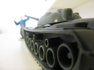
This angle that is focused on the wheel of the tank makes the man seem to be smaller. In real life however, it is around the same size as the tank. Also, the leading lines of the wheels make the tank appear to continue on for much longer than they really do. 


The horse appears to be quite large. It is the same size as the tree, which must mean it's either a big horse, or it was taken from an angle meant to make it seem this way. 

In real life both of the figures are around the same size. However, this picture makes it seem as though the person is much larger. Since I took the picture from the above the man's head, it made it seem like he was looking way down upon the dinosaur. 

This picture was taken from close behind the soldier's head, and with the leaves quite a ways in the background. This allowed the space in between the subjects to act as a minimizer and make the leaves appear smaller. 

The soldier seems as if he could be a part of the scene and almost as though his size would fit in. This happened because I set the figure on a ledge which made him seem taller. I cropped it so that now, it looks like he is kneeling on the ground. 

I took this picture from below which helps to make it seem like the soldier is much smaller than the man. Since his head isn't in the picture, it leaves the observer with the opportunity to decide how it would look and how far it would extend upwards. 

Wednesday, October 17, 2012

Portraits


 I chose this picture because I think that Sadie's face isn't trying to hard. She was relaxed, and it was right after she laughed, meaning that it was just a neutral picture.

Cortland's left eye is in the rule of third, which is why I chose this. 

I chose this because there is emotion in his eyes without him making a face. Also, because it follows the rule of thirds. 

Benji has a real smile, and it wasn't because I asked him to smile. I chose it because he is natural.

I chose this because it's so simple. He also has a look of calmness, and this picture more than most caught my attention. 

Kyle in this picture looks uncomfortable. This is a natural feeling, which is why I thought it was good. If he was acting like he felt comfortable it wouldn't be as real. 

I chose this picture because I think her hair is a good outline of her face. Also, she was looking straight into the camera, so the viewer can see her eyes and the emotion they hold. 

I chose this because it is realistic and her smile is genuine.  

Monday, October 1, 2012

Light Painting


This is an attempt at writing my name with a flashlight. I chose this because although this isn't exactly legible, and you can't even tell its a word, I think it's cool. 


This is a smiley face. I learned from this picture that you can't have marks that don't connect, and all of your lines will be connected in light paintings. 


I think this is a cool picture because instead of the lines of light changing color, the light around the lines change color. This makes it seem like the ball is growing and giving off a green glow. 


While I was painting this, I was moving around from high to low and all back and forward, and I thought it would be crazy and chaotic, but the picture itself came out as pretty even. Also, it looks almost in black and white. 


I thought these lines were cool because it looks like it goes around a ball and continues wrapped around. 


Tuesday, September 25, 2012

Blurry Pictures

I chose this picture because I liked how Grace's face is blurry enough that you can't completely recognize it, but still clear enough that you can tell it's a face. 

This picture shows Amanda, as being a still figure, even though she is running. It was taken at the moment when you can almost see two of her. It would be her as she is, and her as she was one step earlier. 


I took this picture as the car was driving by. This allowed me to have the car in focus, and the backgrounds blurred. This makes the car jump out of the picture and it's automatically what the eye is drawn to. 


I chose this picture because I thought it was interesting how the picture is completely blurred, and all you can see is the colors. There are lines of white throughout the picture, and it is as though there is one strip of colors that was swept across the entire picture. 

Wednesday, September 19, 2012

Depth with Foreground and Background

This picture is of a flower that hangs from a plant. I chose it because I think it is a really good example of showing depth with foreground and background, as there is a clear front and back. 

I chose this picture because the focus is mainly on the two top leafs. This allows the other leafs that are beneath the top two t o become more of the back ground. Also, they are two different colors. 

I chose this picture because the ladybug habitat is in focus, and the rest is blurry. This allows the eyes to go directly to the subject. This is especially important because there are many ladybugs which make your eyes jump around. 

Your eyes are autimatically drawn to the center of the flower. This is because it's the most focused, and this helps to show the pattern inside the flower. 


Depth with repetition


I think this shows depth with repetition because the buttons on the phone are set in rows and columns forming a grid like pattern. This leads the eyes to the phone receiver, and that is where your eyes are drawn.


I think that this picture is given depth with the bars of the fan that lead to the center. This gives the photo a look that continues on even past the picture.


I thought this was interesting how there are lines of text, yet one word is in focus and large. This word pops out to you, and then your eyes are led back as if you're reading the sentence backwards.
The bars of the railing start at the top of the picture and they are parallel moving downwards. I think this shows depth with repetition well. 

Monday, September 10, 2012

Line Perspectives

I saw many different leading lines in this picture, and what really drew me to this was the fact that they were all different, and all going in different directions. They're all different shapes, sizes, and textures, yet they are all leading lines.


I also chose this as one of my pictures, since the lines are all the same size and shape, yet they're all moving in different directions. This makes for a chaotic picture, but that's what I like about it.

I liked the angle that I took this from. There is a bit of a shadow, which also catches my eye. I think this shows leading lines, and also repetition. 


I thought it was interesting how the lines are all leading the eyes to the left side of the picture. I think this is more interesting than having them just lead away down the center of the picture. 


I liked how the lines in the crosswalk were crossing with the shadow of the poles, and also how the street has so many different lines and textures.


Wednesday, September 5, 2012

rule of thirds

I thought that this leaf was a good example of the rule of thirds, since the main leaf in the picture catches your attention. Also, a side note is that the leaf is split into three sections. 

Even though there are many different background objects, the fire alarm captures my attention, since it is following the rule of thirds. 

I think this is a good idea for a portrait, since Amanda's face jumps out. My eye first goes to her face, and then to the other third where there is someone's reflection in the background. 

Even though there are lots of grids (bricks), the plugs stand out as forming their own line in the bottom third of the picture. 

The benches and windows create a grid of their own. 

This is another fire alarm. Both the white and the red jump out, and it is almost as though the white wall could be the aspect that is meant to be noticed.